
Love Vtrender Charts? Check out our new offer!
If there’s one chart that gives away what the real option players are thinking, it’s this one.
We call it the Spectrum Chart — and it’s where the “silent crowd” of option writers start to speak.
This chart doesn’t track price.
It doesn’t chase volume.
It tracks intention.
Specifically — the intentions of those writing options, the ones shaping range, volatility, and direction by their willingness to hold or adjust positions.
And once you learn to read this chart, you'll never look at price the same way again.
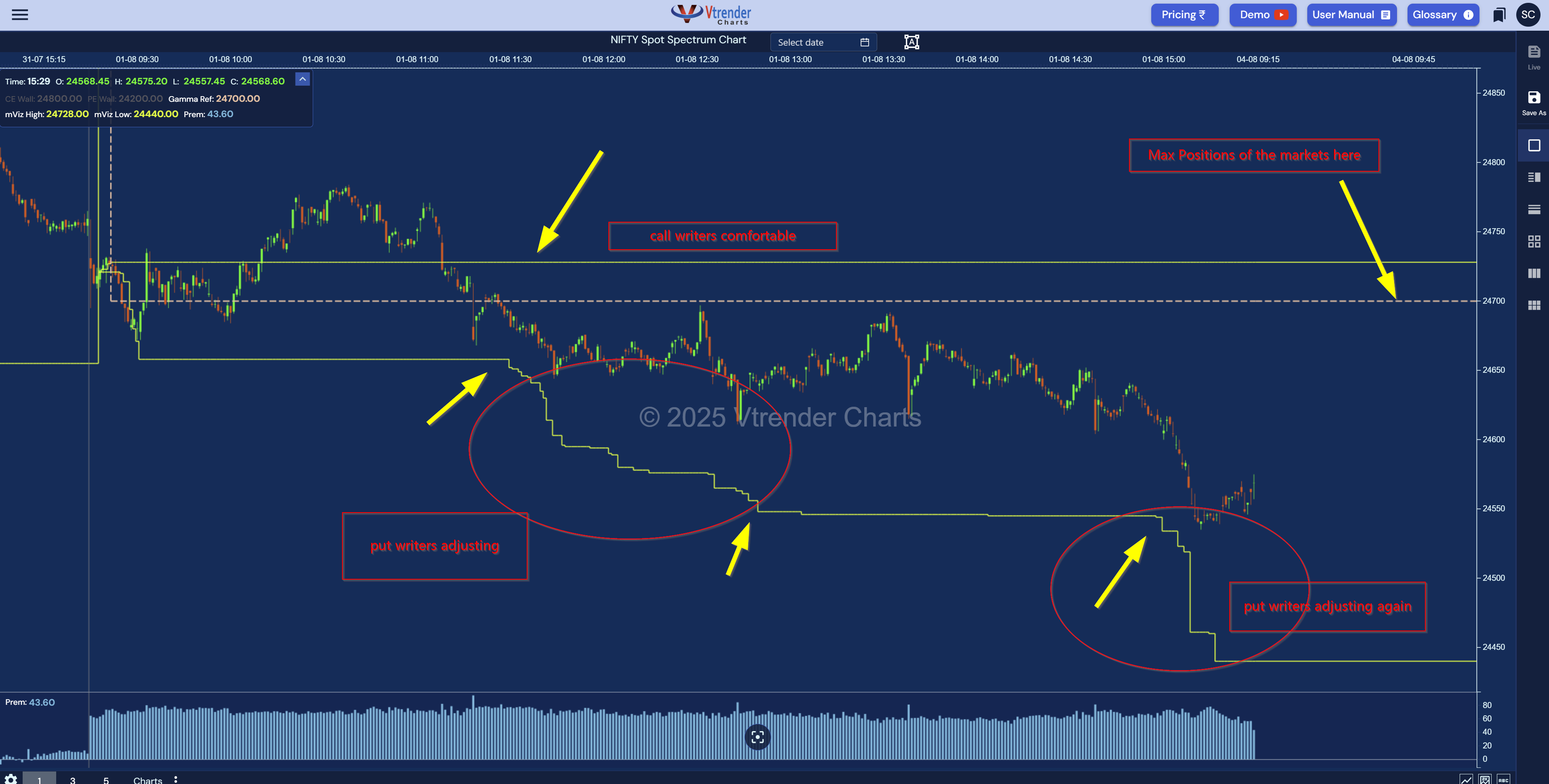
At its simplest, this chart displays where the biggest option positions are parked — and how comfortable or uncomfortable the writers behind those positions are.
There are three key components on the chart:
Dashed Grey Line (Gamma Ref / Gamma Zero)
This is the center of the action. The level where the market has the maximum gamma exposure. Often, this becomes the zone where price gets pinned — especially near expiry. Call it the equilibrium point of the options market.
Yellow Upper Line (Call Writers' Comfort Zone)
This marks the zone where call writers are relaxed. If the market stays below this line, they’re in control. If the line drops — they’re adjusting. And that’s your cue.
Yellow Lower Line (Put Writers' Comfort Zone)
This line represents put writers. A flat line means no stress. A sudden drop tells you they’re getting nervous — likely covering or rolling positions-----they’re adjusting. And that’s your cue.
So in one glance, this chart shows you the confidence level of writers — not what they say, but what their actions reveal.
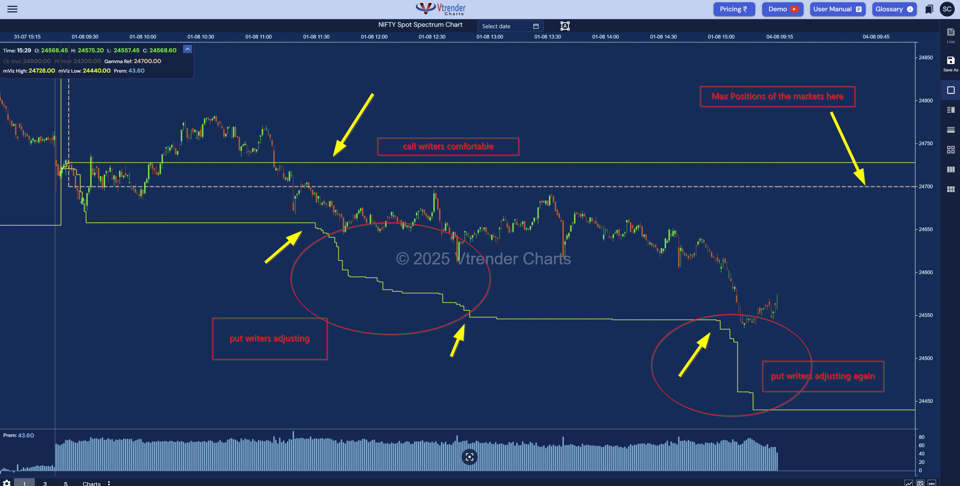
Here’s what the latest chart shows us:
The dashed grey line (Gamma Ref) sits near 24,700.
→ This is the magnetic level where both writers were once balanced.
The upper yellow line is flat and steady.
→ Call writers are comfortable. No panic. No covering.
The lower yellow line drops twice during the session.
→ Put writers are adjusting. They’re backing off. Twice. Under pressure.
This simple shift — a drop in the lower yellow line — is often a precursor to a continued directional move, especially when not matched by an adjustment above.
Remember: when one side flinches, the other dominates.
Most retail traders still try to chase price or predict reversals from candles or RSI signals.
But in today's markets, especially in the NSE Options world, it’s the writers who run the show.
Writers set the range.
Writers manage the volatility.
Writers adjust when their edge is threatened.
And when they adjust — the Spectrum chart shows it in real time.
This is not data from 15 minutes ago.
This is live, from the exchange feed, built into a clean visual so you can see the story unfold.
That’s your edge.
The Spectrum chart trains you to think differently:
You start to recognize risk-on and risk-off behavior of big players.
You stop reacting to price, and instead respond to positioning stress.
You trade based on discomfort zones, not retail emotions.
In short, you learn to trade with the writers — or at the very least, not against them.
When both yellow lines are flat
→ Market is balanced. Expect range and chop. Writers are in control.
Your play: Wait. Don’t chase.
When the lower yellow line drops
→ Put writers are adjusting. Market is under stress.
Your play: Look for shorts or continuation setups.
When the upper yellow line drops
→ Call writers are exiting. Ceiling may break.
Your play: Shift to long bias, especially if price crosses Gamma Ref.
We call it the “Writer’s Walk”:
Price breaks the Gamma Ref.
One yellow line starts shifting.
The shift intensifies.
Price moves further in that direction.
The writer begins to adjust.
That sequence can repeat multiple times intraday — and spotting it can change your entries, exits, and conviction.
The Spectrum chart completes the picture for anyone serious about intraday structure:
NTM VolX shows live demand/supply volume.
Gamma Density shows strike-level expectations.
Orderflow (COT, IS, IB) shows aggression.
DPOC shows developing control points.
Spectrum shows the backbone: who's writing risk and who's folding.
When you have all these pieces, you're not trading in the dark anymore. You’re trading what matters.
We created this chart for you — the serious trader who wants to understand the intention behind market moves, not just react to what’s already happened.
Because once you stop asking “What is the price doing?”
And start asking “Who’s under stress here?” —
That’s when you level up.
The Spectrum chart gives you that lens.
Keep reading it. Keep trading it. Let it sharpen your intuition.
You're now watching what most traders miss.
Let’s move with intent.
Markets don't move because indicators change.
Indicators change because markets move.
A practical reference for NSE & BSE derivatives traders. 366 pages, built to sit open beside live charts.