
Love Vtrender Charts? Check out our new offer!
Every options trader knows this feeling:
Price is moving… but we don’t know if it’s just noise or real intent.
Until now.
At Vtrender, we’ve built a simple but powerful chart that reveals the real-time battle between Demand and Supply. No filters. No lag. No guesswork.
We call it the NTM VolX Chart.
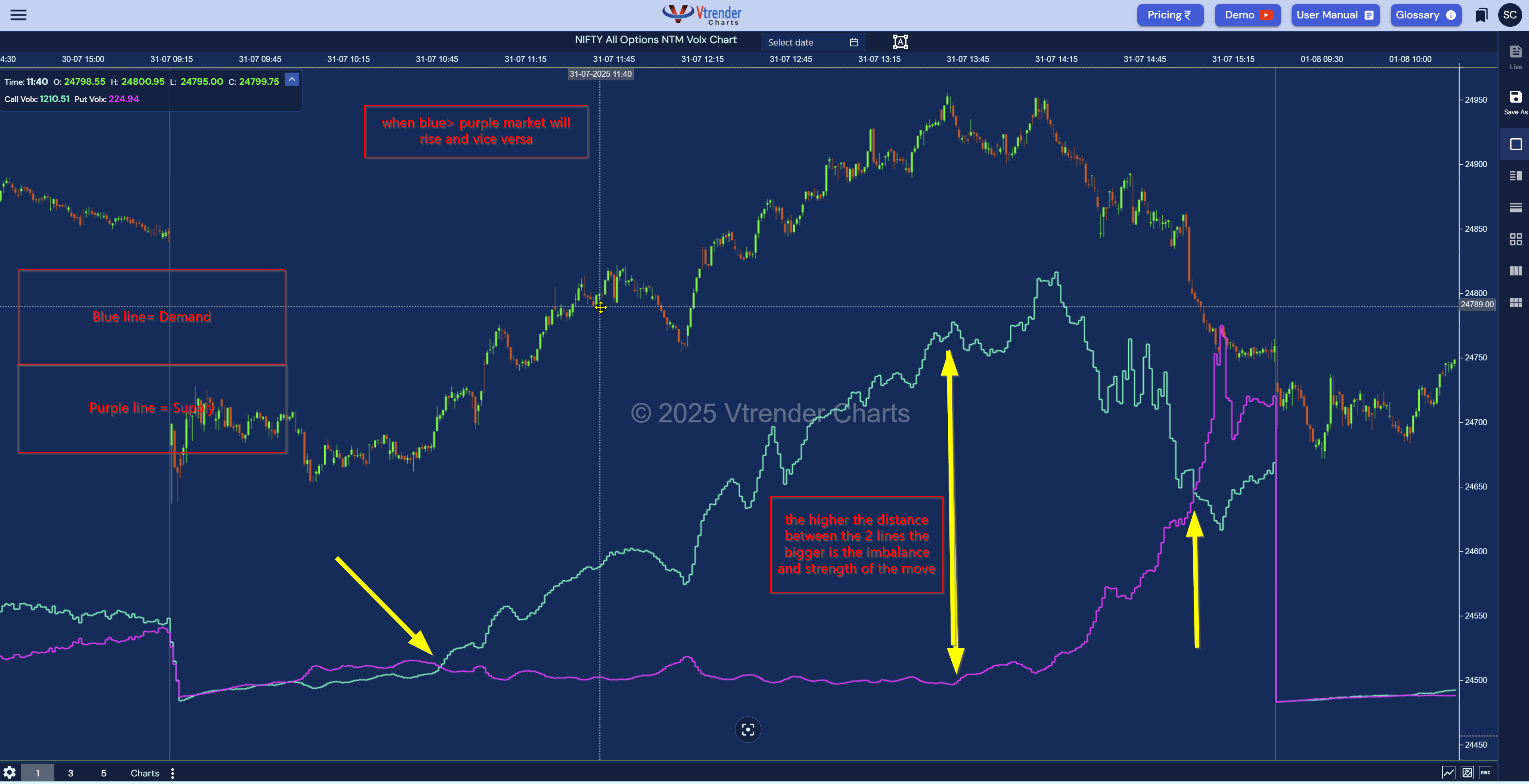
The NTM VolX chart is a live demand-supply meter across all strikes of the Nifty options chain. It’s designed for traders who want to read the market by positioning activity, not just price.
The idea is simple:
The Blue Line represents Demand (Buy-side pressure)
The Purple Line represents Supply (Sell-side pressure)
When blue > purple → demand is overpowering supply → expect price to rise.
When purple > blue → supply is dominant → price likely to fall.
And when both lines move in sync?
Welcome to a balanced market—where writers rule and decay begins.
NTM VolX plots are powered by tick-by-tick data from the exchange, categorized into:
✅ Buy to Open (BTO) → New long positions (adds to blue)
✅ Sell to Close (STC) → Longs exiting (reduces blue)
✅ Sell to Open (STO) → New short positions (adds to purple)
✅ Buy to Close (BTC) → Shorts exiting (reduces purple)
We’ve coded our charting engine to decode each transaction and classify it into these buckets. Then we map them across time into live cumulative demand and supply lines.
What you see on screen is the real-time heartbeat of every open, close, add, and exit happening across the entire options chain.
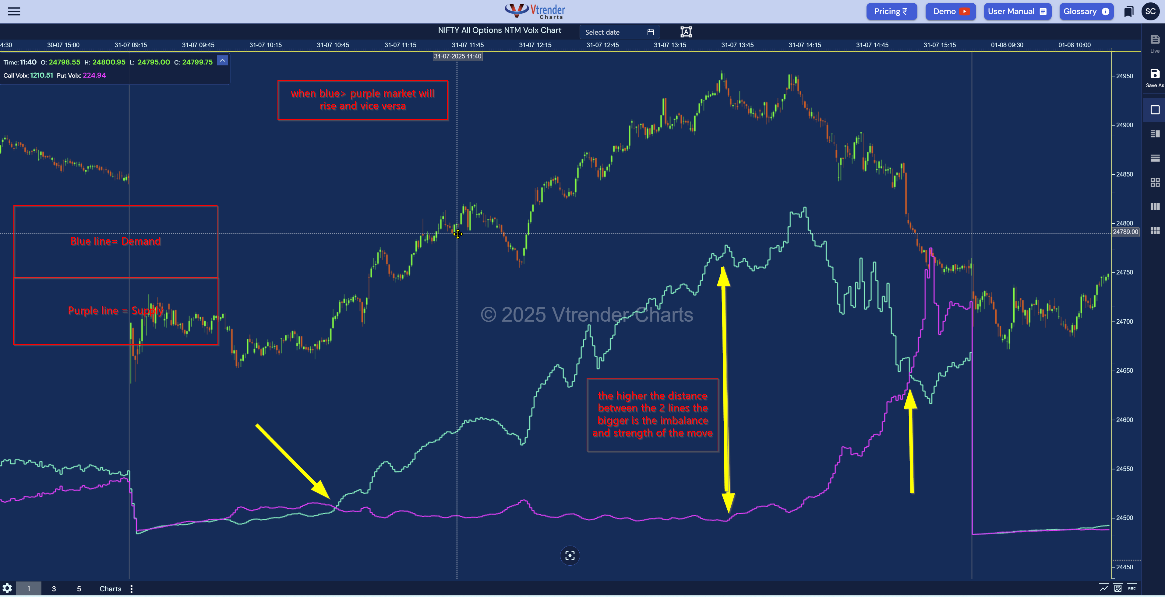
The rules are beautifully straightforward:
More traders are entering fresh long positions across strikes.
Demand is building.
More short positions are being initiated—supply is pressuring the system.
This is the tricky one—both bulls and bears are active.
But what matters here is who’s rising faster.
Here’s the magic:
The greater the distance between the two lines, the stronger the directional imbalance.
If blue surges and purple flattens → strong bullish imbalance
If purple spikes and blue drops → strong bearish imbalance
If both flatten → equilibrium = decay zone
Most retail traders get trapped reacting to price alone.
But price can be manipulated, delayed, or distorted.
Positioning, on the other hand, is truth.
NTM VolX lets you read the intent of the market participants:
Are they adding to risk?
Are they unwinding?
Is this a trap or conviction?
Once you learn to track these flows, your trade decisions become more aligned with market structure—not just reactive candles.
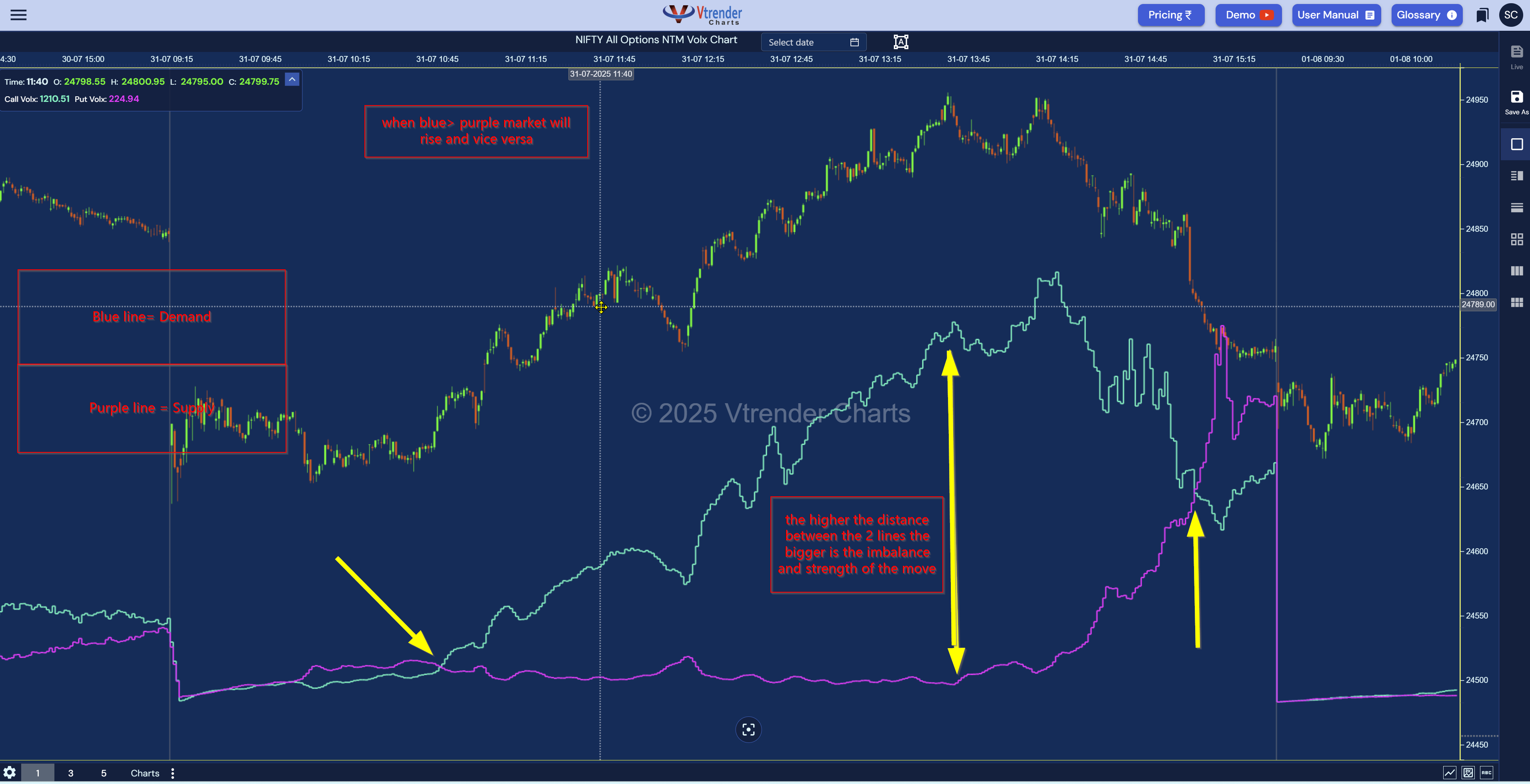
Let’s dissect the chart above together:
Notice how both lines start close to each other.
This is a balanced environment—buyers and sellers are probing, but no side is in control.
As we move through 10:30–11:30 AM, blue shoots up while purple flattens.
This is classic initiative buying—fresh demand entering the market.
Sure enough, the NIFTY spot starts trending higher in sync.
Around 1:30 PM, something changes. The purple line rapidly climbs and overtakes blue.
What’s happening?
Supply pressure re-enters—the short sellers are back.
The market responds immediately with a sharp fall.
Post 3 PM, both lines flatten again.
No fresh long or short participation.
Just existing positions holding—a writer’s market begins.
This chart is incredibly versatile. Here are five battle-tested applications:
Is that breakout real?
Check if the blue line is rising fast with price. If yes, fresh demand is pushing the move.
If not, it's just stop-hunting.
You may have the right direction, but wrong timing.
NTM VolX helps you see when momentum is actually building, not just assumed from price patterns.
When purple builds and price falls, watch closely—
If the blue suddenly spikes and price rebounds, it’s a short trap.
You’ll often be early to the reversal.
If both blue and purple lines are flat or hugging each other closely, avoid trades.
The market is balanced, and premium decay is eating both sides alive.
Writers dominate expiry days.
NTM VolX helps you see when demand-supply suddenly skews, even in the last 45 minutes.
You’ll find this gem inside your charts.vtrender.com dashboard.
Look under:
🟪 NTM Volume X Chart
✅ Choose symbol: NIFTY
💡 Overlay: Spot chart + Demand-Supply lines
Real-time. Fast feed. Available during live markets and post-session playback.
In a world full of noisy indicators, NTM VolX is signal.
It doesn’t tell you what happened—it shows you what’s happening right now.
And it doesn’t just show price—it shows why price is moving.
That’s the edge.
Explore more:
Markets don't move because indicators change.
Indicators change because markets move.
A practical reference for NSE & BSE derivatives traders. 366 pages, built to sit open beside live charts.