
Love Vtrender Charts? Check out our new offer!
The free plan on Vtrender Charts is not a demo page with no practical use. It gives traders a real starting point: Market Profile charts for the major Indian index markets, running on delayed exchange data.
Terms used in this note: POC, Value Area, VAH / VAL, Initial Balance, TPO.
Market Profile is the foundation layer in the Vtrender process. Before a trader studies Order Flow, Gamma, NTM VolX, or MFLOW, the trader first needs to know where the auction has accepted value and where price is only passing through.
The free plan helps answer the first structural questions of any session:
Where is the current session building value?
Where is the Point of Control?
Is price trading inside or outside value?
Is the day balanced, directional, or unresolved?
Is the market accepting higher or lower prices?
These are not beginner questions. They are foundation questions. A trader who uses Order Flow, Gamma, or Spectrum every day still reads structure first.
Market Profile is now free on charts.vtrender.com.
That sentence is worth sitting with for a moment. A time-price distribution chart covering NIFTY across daily, weekly, and monthly timeframes, with full TPO lettering, value area computation, and POC identification — available at zero cost to any registered user.
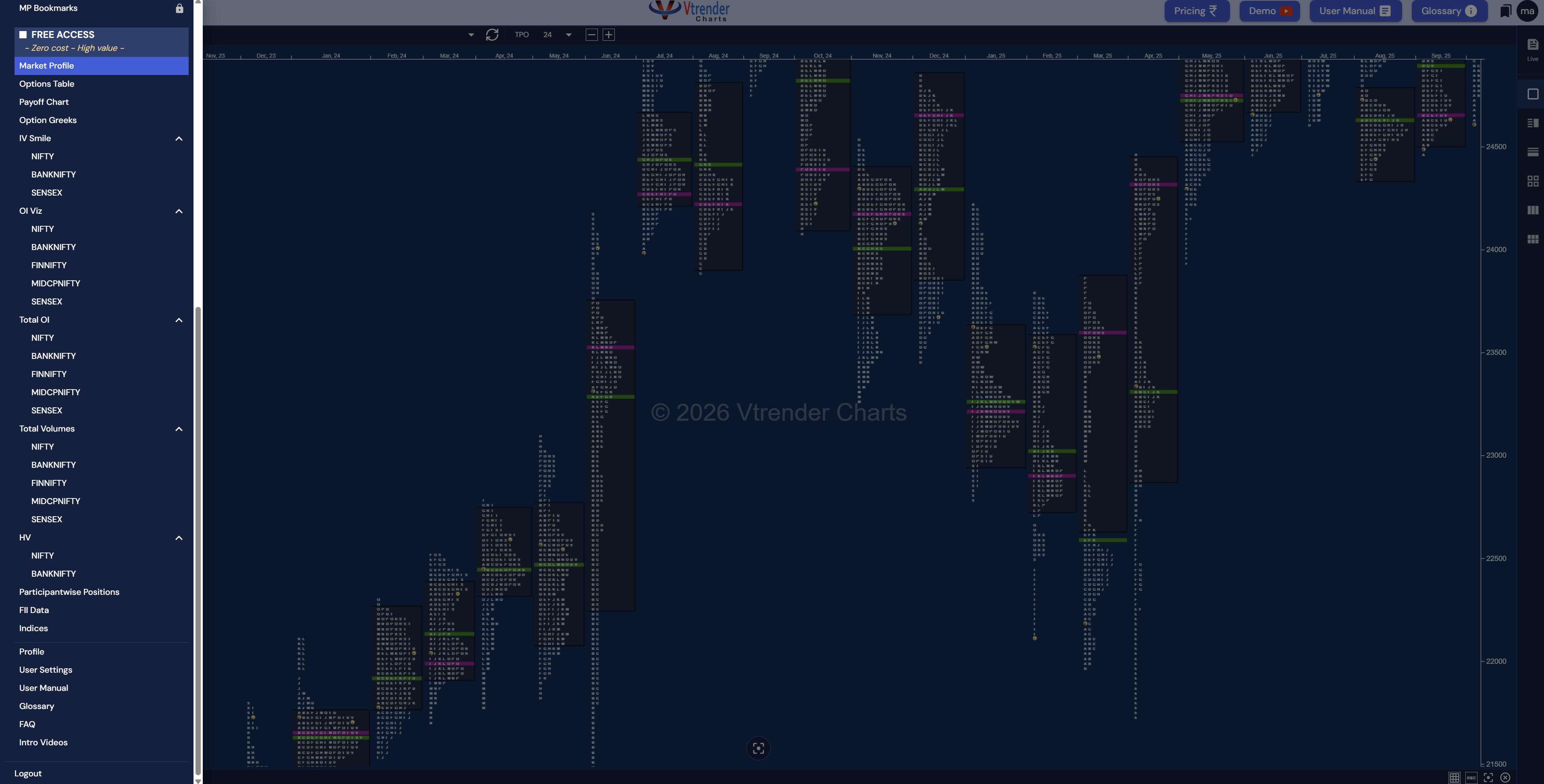
The screenshot at the top of this post shows the monthly Market Profile view for NIFTY. Each vertical cluster of letters represents a session. The wider sections are where the market spent the most time — the value zones. The thin extensions at the tops and bottoms are where price was rejected. The green and pink highlights mark specific structural points: POC levels, single prints, and excess.
A trader who understands how to read this chart can identify value migration across months, spot rotational versus trending regimes, and locate the exact prices where the market found agreement or disagreement. That information comes from the structure of the session itself, not from any indicator or formula.
And it is free.
Log in to charts.vtrender.com and open the sidebar. The section labelled FREE ACCESS contains the following tools:
Market Profile — The anchor. TPO charts for NIFTY with selectable timeframes (the TPO selector at the top of the chart defaults to 24, showing the full composite). The chart shows value areas, points of control, single prints, excess, and session-by-session development. The same Market Profile methodology developed by Steidlmayer and extended by Dalton, rendered on live Indian exchange data.
Options Table — The live options chain for NIFTY, BANKNIFTY, and SENSEX. Premiums, volumes, open interest, change in OI, and implied volatility for every active strike. Updated continuously from NSE data. The two highest-OI strikes on the Call and Put sides define the market's expected range for the current expiry. That is the first number a professional desk checks every morning.
Payoff Chart — Select any combination of strikes, quantities, and directions. The chart plots profit and loss at every price level at expiry. Before committing capital to any options position, this tool shows the full P&L curve: where the position makes money, where it loses, and where it breaks even.
Option Greeks — Delta, Gamma, Theta, Vega for any position. These are not theoretical values from a textbook. They are computed from live market data and update as premiums change. A trader selling the 24000 Call can see exactly how much theta they collect per day and how much gamma exposure they carry.
IV Smile — Implied volatility plotted across all strikes for NIFTY, BANKNIFTY, and SENSEX. The shape of this curve tells you whether the market is pricing more downside risk (steep Put side) or balanced expectations (symmetric). Changes in the skew between sessions are often the first sign that risk perception has shifted.
OI Viz — Open interest distribution across strikes, tracked over multiple sessions, for NIFTY, BANKNIFTY, FINNIFTY, MIDCPNIFTY, and SENSEX. This is not a snapshot. It is a film. Strike migration — the highest-OI Call strike moving from 24000 to 23500 over three days — shows the options market repricing its expected range. OI buildup acceleration at a single strike marks a structural wall. OI unwinding marks a weakening one.
Total OI — Aggregate open interest across all strikes for the same five instruments. Rising total OI means new money entering the market. Falling total OI means positions closing. The direction of aggregate OI is a conviction indicator: the market is either adding exposure or reducing it.
Total Volumes — Aggregate trading volumes across instruments. Volume confirms price. A 200-point NIFTY move on 30% above-average volume is a different event from the same move on 60% below-average volume. One has participation behind it. The other does not.
HV (Historical Volatility) — Actual realised volatility for NIFTY and BANKNIFTY across multiple lookback windows (10-day, 20-day, 30-day). Comparing HV with IV from the IV Smile chart shows whether options are priced above or below what the market actually delivered. That gap is a core input for options strategy selection.
Participantwise Positions — Positioning broken down by FII (Foreign Institutional), DII (Domestic Institutional), Proprietary, and Client (retail) categories. The divergence between categories is often the signal. When FIIs and retail are positioned opposite each other, someone is going to be wrong.
FII Data — Foreign Institutional Investors' daily positions in index futures, index options, stock futures, and stock options. Net long or net short, with daily changes. FIIs are the single largest category of participant in NSE derivatives. Their positioning direction is not a prediction. It is a fact about where the largest money sits.
Indices — Component-level decomposition of index movement. When NIFTY moves 200 points, this tool shows whether it was broad-based (30 stocks contributing) or concentrated (Reliance and HDFC Bank carrying the move). Broad moves sustain. Narrow moves are fragile.
The chart deserves a closer look.
The image shows NIFTY on a monthly TPO (Time Price Opportunity) view. Each letter in the chart represents a 30-minute trading period. The A period covers 9:15 to 9:45. B covers 9:45 to 10:15. And so on through the session. Letters stack horizontally at each price level: the more letters at a price, the more time the market spent there.
The widest section of any session is the Point of Control (POC): the price with the most time and volume. The range containing approximately 70% of the session activity is the Value Area, bounded by VAH (Value Area High) at the top and VAL (Value Area Low) at the bottom.
Three structural observations emerge from the chart:
The tall, thin sessions with minimal width (visible in the March 2024 and October 2024 periods) are trend days. Price moved in one direction without returning. Single prints — prices visited by only one letter — line the path. These are areas the market passed through too quickly to establish acceptance. When price returns to these levels in subsequent sessions, they often produce a reaction.
The wide, bell-shaped sessions (visible in July-August 2024) are rotational. The market found a range and traded within it. The POC is centred. The tails at the extremes show where price was rejected. These sessions are balanced: buyers and sellers agreed on a range.
The migration of value over time is visible in the horizontal drift of the wide sections. From September 2023 through March 2024, the value zones migrated higher. From September 2024 through March 2025, value compressed and then broke lower. The direction and pace of value migration defines the broader market regime.
None of this requires an indicator. The data is time and price. The structure is the market's own record.
Open the platform at 8:50 AM. Run these in order:
Check yesterday's Market Profile. Note the day type (trend, balanced, rotational), the DPOC, and the VAH/VAL. These levels carry forward. Today's open relative to yesterday's Value Area defines the opening context.
Open the Options Table. Find the strikes with the highest Call OI and the highest Put OI. The distance between them is the market's expected range for the current expiry.
Open OI Viz. Check whether those high-OI strikes shifted from the previous session. If they migrated, the range is being repriced. Note the direction.
Check Total OI. Rising or falling. New conviction or unwinding.
Open IV Smile. Note the ATM IV and compare it to the 10-day HV from the HV chart. If IV is significantly above HV, options are expensive. If below, they are cheap.
Open FII Data. Net long or short in index futures. What changed from yesterday.
That takes ten minutes. The result: value location (Market Profile), range boundaries (Options Table), range stability (OI Viz), market conviction (Total OI), volatility regime (IV Smile vs HV), and institutional positioning (FII Data). Six data points from six tools. No indicators, no drawn lines, no subjective interpretation.
The free plan is data-rich. It covers options positioning, volatility structure, institutional activity, market structure, and trade planning.
What it does not cover is real-time intent.
The premium tiers add three layers. The Professional plan includes Spectrum (gamma-based inventory ranges), NTM VolX (near-the-money options volume), WCash (options writer P&L), Straddles (ATM straddle pricing), and NTM OI (near-the-money open interest). These are live options flow tools that show what is happening inside the options market in real time.
The Elite plan adds Orderflow (tick-by-tick buying and selling classified as initiative or responsive), Gamma Density (hedging pressure distribution across individual strikes), Gamma Exposure (aggregate dealer positioning), Orderflow Replay (historical session playback), and Smart Candlesticks (candlesticks enhanced with Order Flow and Market Profile data).
The free tier shows where value is, where the range is, and how participants are positioned. The premium tiers show who is active at each price right now and where the mechanical boundaries sit.
The Demo button in the platform header opens a live walkthrough of the premium tools. The pricing page is at charts.vtrender.com/subscription.
Free account.-. Market Profile, Options Table, OI Viz, IV Smile, HV, Total OI, Total Volumes, Payoff Chart, Option Greeks, Participantwise Positions, FII Data, Indices.
No trial period. No feature countdown. The tools remain active indefinitely.
The free plan helps answer the first structural questions:
Where is the current session building value?
Where is the Point of Control?
Is price trading inside or outside value?
Is the day balanced, directional or unresolved?
Is the market accepting higher or lower prices?
These questions are not beginner questions. They are foundation questions. Even an advanced trader who uses Order Flow, Gamma or Spectrum still needs structure first.
The free plan is therefore best used as Layer 1 of the Vtrender Learning Pathway. Start with Market Profile. Learn TPO, Value Area, POC, Initial Balance and day types. Then move to the deeper tools.
After Market Profile, the next steps are:
Order Flow, to see who acted inside the structure.
NTM VolX, to read near-the-money options pressure.
Spectrum, to see CE and PE walls on the price axis.
MFLOW, to separate new business from old business.
Smart Candlesticks, to place flow inside each candle.
Options Table, to read OI, dOI, VWAP and DPOC at strike level.
If you are new to Vtrender, do not start by opening every tool at once. Start with the free chart. Ask where value is. Ask whether price is accepted or rejected. Then add one layer at a time.
Read next: A Beginner's Guide to Market Profile, A Beginner's Guide to Reading Order Flow Charts, and The Vtrender Learning Pathway.
Open the free plan here: Vtrender Charts. For definitions of terms like TPO, POC and Value Area, use the Vtrender Glossary.
Vtrender is a registered NSE and BSE data vendor. All chart data is sourced directly from the exchange. Market Profile methodology follows the Steidlmayer/Dalton framework. Charts platform version 1.6.3.
For structured learning: the E-Course covers Market Profile, Order Flow,
If you prefer to read instead look up Power Trading with MarketProfile and Orderflow - our best seller on Amazon.
Markets don't move because indicators change.
Indicators change because markets move.
A practical reference for NSE & BSE derivatives traders. 366 pages, built to sit open beside live charts.