
Love Vtrender Charts? Check out our new offer!
Let me start with something that's probably happened to you more times than you'd care to admit. You're watching your screen, you see a strong green candle forming, everything looks bullish, so you enter long. Then, almost immediately, price starts moving against you. The candle showed buying pressure, but somehow you ended up on the wrong side of the trade.
Here's what I want you to understand: that frustration isn't because you're a bad trader. It's because candlesticks, for all their popularity, only tell you part of the story. They show you what happened, but they don't show you who made it happen or how committed they were to making it happen.
And in markets, that difference between what and who can make or break your trading account.
The hidden forces behind market moves - a deep dive - Check at
Now, let me share something with you that most retail platforms won't teach you. At any given moment in the NSE derivatives market, there aren't just one or two prices – there are actually three prices you need to understand:
The bid price – what buyers are willing to pay right now
The ask price – what sellers are demanding right now
The last traded price – what actually printed when someone got aggressive
Here's the key insight: that last traded price only moves when someone shows real intent. When someone decides they can't wait anymore and either hits the bid or lifts the ask.
Two traders sitting patiently with limit orders? They don't move markets. They provide liquidity, but they don't create the momentum that drives trends.
This is exactly why traditional one-minute OHLC data misses the entire story. Those bars can tell you that Bank Nifty moved from 24,650 to 24,700, but they can't tell you whether that move was driven by aggressive institutional buying or just scattered retail covering. And believe me, that distinction matters more than most traders realize.
Let me explain what we're really looking at when we analyze order flow. Think of the market like a conversation between two groups – those who are asking urgent questions and those who are providing patient answers.
Some market participants are like patient teachers, placing limit orders and waiting. But others are like urgent students, throwing market orders at whatever price is available because they need to act now. These urgent participants – the ones showing real intent – are what we call Initiative Buyers and Initiative Sellers.
Exploring the dynamics of Orderflow - A closer look : https://vtrender.com/posts/exploring-the-dynamics-of-order-flow-in-market-trading
When you see those purple and green bars marked IB or IS in our charts, you're not looking at random retail activity. You're witnessing moments when someone with significant capital decided that waiting was more expensive than acting immediately. These could be institutional algorithms, informed traders, or large participants who have decided the current price is either too cheap or too expensive to ignore.
But here's where it gets more sophisticated, and this is something most order flow platforms miss. Markets aren't just about initiative – they're about response. For every aggressive buyer, there needs to be willing sellers. For every initiative seller, there needs to be responsive buyers ready to absorb that pressure.
This is where Responsive Buyers and Responsive Sellers – what we call RB and RS – come into the picture. These are typically the other side of those initiative trades. When you see massive initiative selling hitting Bank Nifty, responsive buyers are the ones who come later up at lower levels and are seen as profit bookings to complete the cycle
The pulse of the Markets - https://vtrender.com/posts/what-is-order-flow
Here's what's interesting: during intraday sessions, much of this responsive activity represents the unwinding of earlier positions. That huge initiative buying you witnessed during the 9:15 opening? Those responsive sellers appearing in the afternoon session might be the same participants booking profits. It's like listening to a conversation between the market's most informed players.
Now, let me introduce you to something we call Commitment of Trade, or COT. Traditional volume analysis just shows you how much traded. COT shows you who was more committed, more determined, more convinced about their position.
Think of it this way: COT is like the market's voting system, but instead of just counting votes, it weighs them by conviction. A trader who aggressively hits the bid with substantial size is casting a much heavier vote than someone placing a small limit order and hoping.
During the 10:30 to 11:00 session in NSE derivatives, when institutional activity typically peaks, COT can show you which side – buyers or sellers – is showing more commitment at each price level. This isn't just helpful information; it's actionable intelligence that can guide your entry and exit decisions.
When you combine Initiative Buyer and Seller activity with Responsive patterns, then layer on COT commitment levels, something remarkable happens. You start seeing market structure in three dimensions instead of two.
You're not just seeing price movement – you're seeing the intention behind it, the response it generates, and the commitment level of the participants driving it. You're witnessing the actual decision-making process of the market's most significant players.
Let me give you a practical example. Say you're watching Nifty futures approach a key resistance level around 25,000. Traditional analysis might show you a red candle at that level and suggest resistance held. But order flow analysis reveals whether that red candle formed because of genuine initiative selling from institutions or just profit-booking from earlier long positions.
If you see strong Initiative Selling bars with high COT commitment, that resistance is likely to hold. But if you see mostly Responsive Selling with weak commitment levels, that resistance might be more fragile than it appears.
Here's how this changes your trading approach. Instead of wondering "Will this breakout sustain?" you can observe in real-time whether Initiative Buyers are expanding their activity above the breakout level or if the move is just driven by responsive covering.
Instead of hoping your support level holds, you can see whether genuine Initiative Buying is emerging at that level or if it's just tentative nibbling that could easily be overwhelmed.
The edge every trader needs - https://vtrender.com/posts/the-essential-order-flow-guide-understanding-what-moves-markets-beyond-price
During the crucial 3:00 to 3:20 afternoon session, when many institutional strategies get unwound, COT can show you whether selling pressure represents genuine institutional distribution or just natural profit-taking that will soon exhaust itself.
This level of analysis is only possible with direct NSE tick data and bid-ask information. Every minute of delay, every level of data aggregation removes crucial information about participant behavior. Those OHLC bars that most platforms provide? They're like reading a movie summary when you could be watching the actual film.
When you can see the raw intentions of Bank Nifty traders as they happen, when you can distinguish between initiative and responsive activity in real-time, you're no longer trading blind. You're trading with the same information that moves markets.
We’ve built these charts for execution-level clarity. Everything is designed for fast reads and confident action.
Here’s what you’ll find:
Initiative Bars (IB & IS): These are bars where buyers or sellers take control by trading through previous volume levels. We mark them clearly so you can react — or stay out.
COT (Commitment of Traders): No more guessing delta. We show you real buyer/seller imbalances in the bar — clean, color-coded, and filterable.
Volume Profiles inside bars: Spot exactly where absorption or breakout volume occurred.
Smart Annotations: VWAP, DPOC, bar-level POCs — all highlighted for context.
Time-matched heatmaps: Match buyer/seller intent to volume and price zone.
And it’s not just what’s on screen. It’s how fast you can use it to decide.
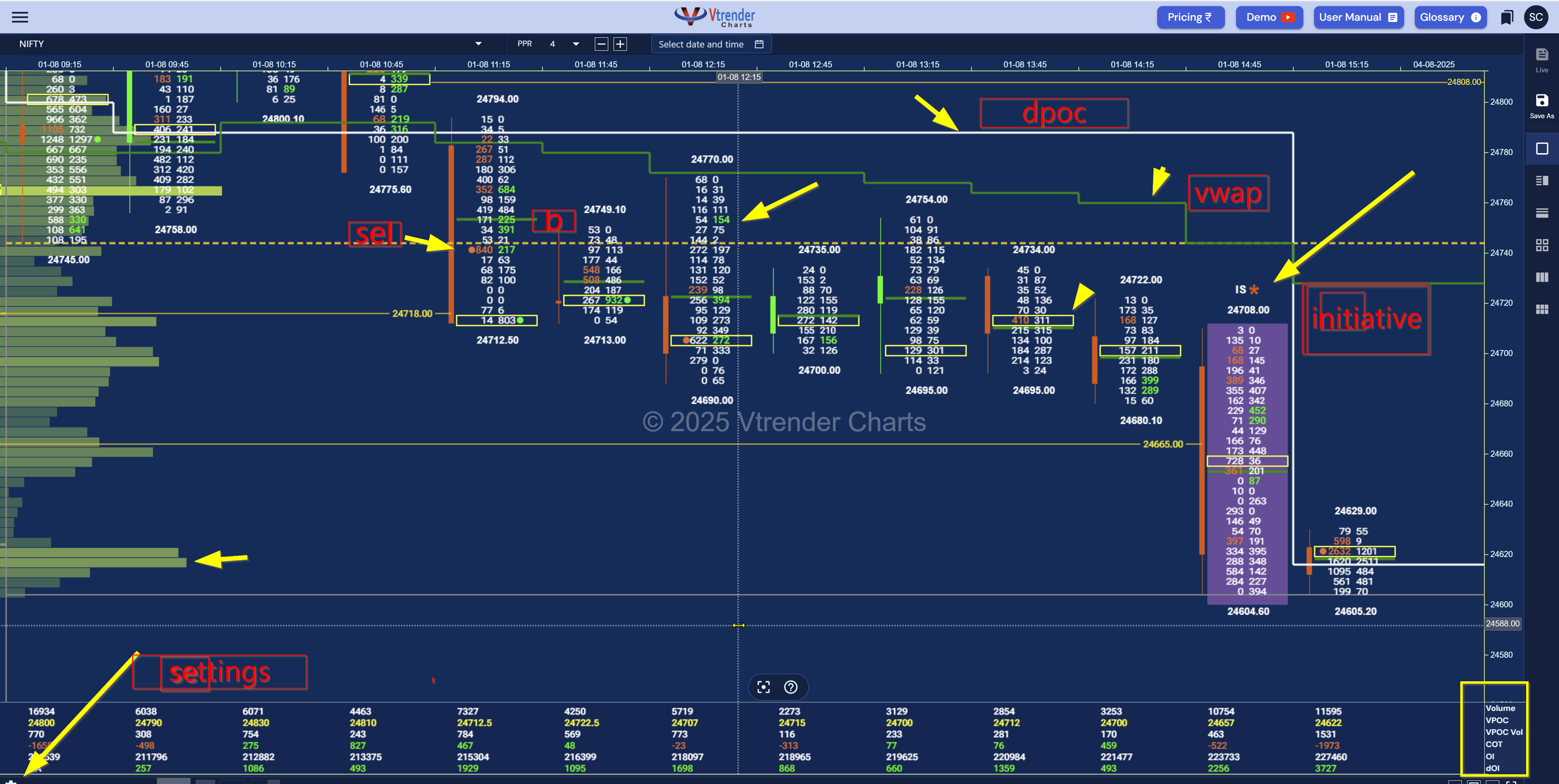
This is not your average candlestick.
Each box tells a story. And we teach you how to read that story.
What I want you to understand is this: order flow analysis doesn't just change how you read charts – it changes how you think about markets. You stop being surprised by sudden reversals because you can see the early warning signs in initiative and responsive activity patterns.
You stop chasing breakouts that lack conviction because COT shows you the commitment level behind the move. You stop getting trapped in false support because you can distinguish between genuine buying interest and temporary covering.
Most importantly, you stop reacting to price movements and start anticipating the forces that create those movements.
We don’t want you to predict the market. We want you to understand it in real-time.
That’s the promise of Vtrender Orderflow:
Clean.
Fast.
Contextual.
Built for action.
Because your entry isn’t random. And neither should be your reason to stay in.
Look, I'm not going to overwhelm you with a dozen call-to-action buttons or urgent sales messages. What I will tell you is this: once you understand how markets actually trade behind those red and green candles, your entire approach to trading transforms.
The order flow concepts we use – Initiative and Responsive activity, COT commitment analysis, real-time participant behavior – these aren't just features on a chart. They're a completely different way of understanding market structure.
Strategies used in Orderflow today - https://vtrender.com/posts/order-flow-analysis-strategies-used-to-trade
If you're ready to move beyond candlestick guesswork and start reading actual market intent, our live charts demonstrate these concepts in real NSE market conditions. You can explore the platform, see how IB/IS activity unfolds during different sessions, and observe how COT patterns develop around key price levels.
But more importantly, you can start seeing markets the way institutional traders see them – not as random price movements, but as the logical result of participant behavior, commitment, and intent.
Because your next trade doesn't have to be based on hope. It can be based on understanding what's actually happening in the market right now.
Ready to see order flow analysis in action? Visit our live charts platform and observe how Initiative and Responsive activity unfolds in real NSE derivatives sessions.
→ Access Live Orderflow Charts Now
And if you want a crash course in how we read these bars —
check out our glossary:
🔗 https://vtrender.com/glossary
Markets don't move because indicators change.
Indicators change because markets move.
A practical reference for NSE & BSE derivatives traders. 366 pages, built to sit open beside live charts.