
Love Vtrender Charts? Check out our new offer!
In the ever-evolving world of derivatives trading, knowing where the market is going is only half the story. The other half — the one most traders miss — lies in understanding who’s positioned where, and what happens when price moves because of that positioning.
That’s where Gamma Exposure comes in. And we’re thrilled to bring it visually and interactively to your Vtrender charting experience.
This isn’t another "options trick" — this is institutional-level insight… now in real-time.
👉 Try it live: https://vtrender.com/live-charts
At its core, Gamma Exposure measures the effect of price movements on the delta hedging activity of option market participants.
Think of it simply:
If traders are long gamma → they are net buyers expecting big moves and profit from directional moves
If traders are short gamma → they are expecting range-bound, sideways action
These invisible forces, hidden from candlestick charts, shape every move — from tight consolidations to explosive breakouts.
Want to understand exactly how these forces work with real-world analogies? Read our complete guide: The Hidden Force That Moves Markets
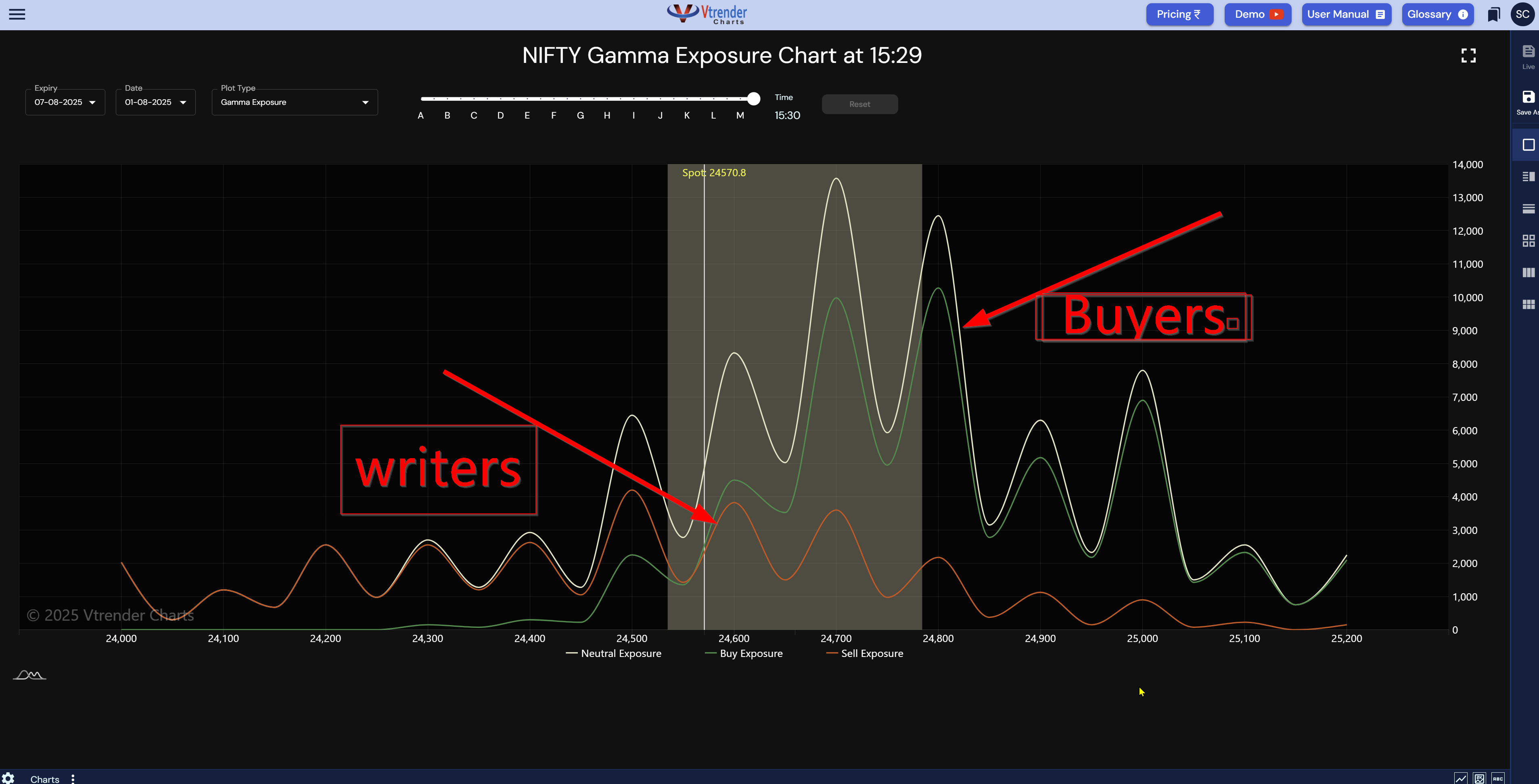
Let’s break down the image you see above (snapshot of NIFTY):
The green curve represents Buy Exposure — think of this as long gamma territory.
The orange curve is Sell Exposure — your short gamma land.
The white line is Net Gamma Exposure — the net balance of hedging forces at play.
You can now clearly see who dominates which strikes:
Between 24,300 and 24,500, sellers (writers) hold sway — the gamma curve dips.
From 24,600 onwards, buyers take charge — long gamma builds up.
This isn’t just data. This is a map of market sensitivity.
Because when you know where long gamma and short gamma reside:
🔒 You know where the market might stay - Below long gamma Buyers are winning clean
🔓 You know where it might break fast (short gamma = fast zones)
📉 You can identify zones quickly where market traders are caught upside down
This lets you:
Size trades smarter
Pick better option strategies
Avoid getting trapped at reversals
Position for acceleration, not confusion
High Gamma Exposure zones are like gravity. The market loves sticking to them. If price is dancing near a long gamma peak, expect:
Slow moves
Quick mean reversions
Ideal for neutral strategies like straddles or strangles
These are your breakaway points. When price enters a zone of low or negative gamma, hedgers chase the move, not counter it.
Expect:
Quick expansions
Strong directional flows
Great for long option setups or momentum scalps
At 15:29, Spot is 24570.8, right at the cusp of two forces:
Below lies seller territory (risk)
Above, the buyers (supportive)
This is the zone of transition — a perfect moment to monitor reactions.
Most traders react to candles. Pros act based on positioning.
This chart gives you a live lens into how the market is armed — not just where it’s trading.
You can now:
See the pressure zones
Anticipate PRO behavior
Trade like a pro — without guessing
This is the future of derivative analysis. Not hindsight — foresight.
But here's the thing: seeing the chart is just the beginning. Understanding why these forces work the way they do, how they create market dynamics, and what drives institutional positioning — that's where the real edge comes from.
Ready to master the fundamentals behind these patterns? Dive deep: Understanding Gamma Exposure Like Never Before
We’ve added Gamma Exposure to your Vtrender charts — live, intraday, and expiry-wise. You can:
Filter by expiry
Scroll through time of day
Identify your high-risk vs high-control zones every minute
Want to go even deeper into the logic behind this? Read our intro to Gamma Density here:
🔗 https://vtrender.com/posts/introducing-the-gamma-density-chart-on-vtrender
Markets move because people move money. Gamma Exposure tells you how they’ll likely move it next.
So the next time you're about to place a trade, don’t just ask:
"What is price doing?"
Ask:
"What are the hedgers forced to do if price moves next?"
Now, you have the answer. In color. In real-time.
But if you want to truly understand the invisible forces behind these charts — the analogies, the mechanics, the institutional psychology — take the deep dive into our comprehensive guide.
Start here: The Hidden Force That Moves Markets
Trade here: Live Gamma Charts
Welcome to trading with an edge.
Markets don't move because indicators change.
Indicators change because markets move.
A practical reference for NSE & BSE derivatives traders. 366 pages, built to sit open beside live charts.